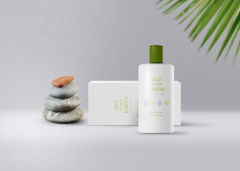
Salt of the Earth Skincare
Salt of the Earth is an organic, handmade body products company that uses all natural ingredients.
I chose to go with a floral theme due to the company’s tropical location (the Bahamas) and the natural/organic nature of the products. I thought it would appeal to the target audience as well (women ages 30+).
First, I put together the color scheme based partly on colors the client is partial to, combined with what would be appropriate for the brand. I chose a typeface to reflect the organic feel the client was looking for. I then designed the logo and some graphics and patterns to be used bottles on packaging.
Keywords: organic, clean, simple
This is a concept/personal project.


