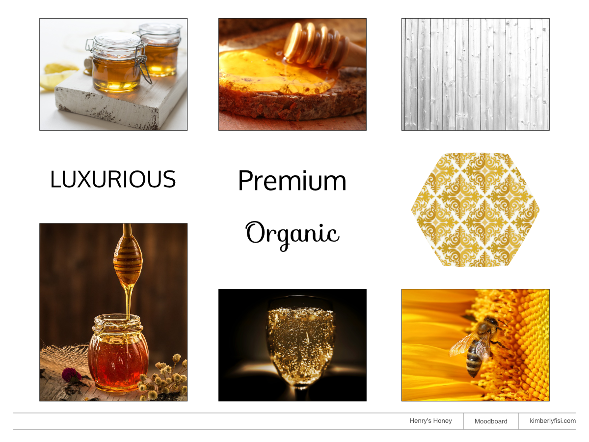
Henry’s Honey is a premium British company that prides themselves on producing luxury, organic honey.
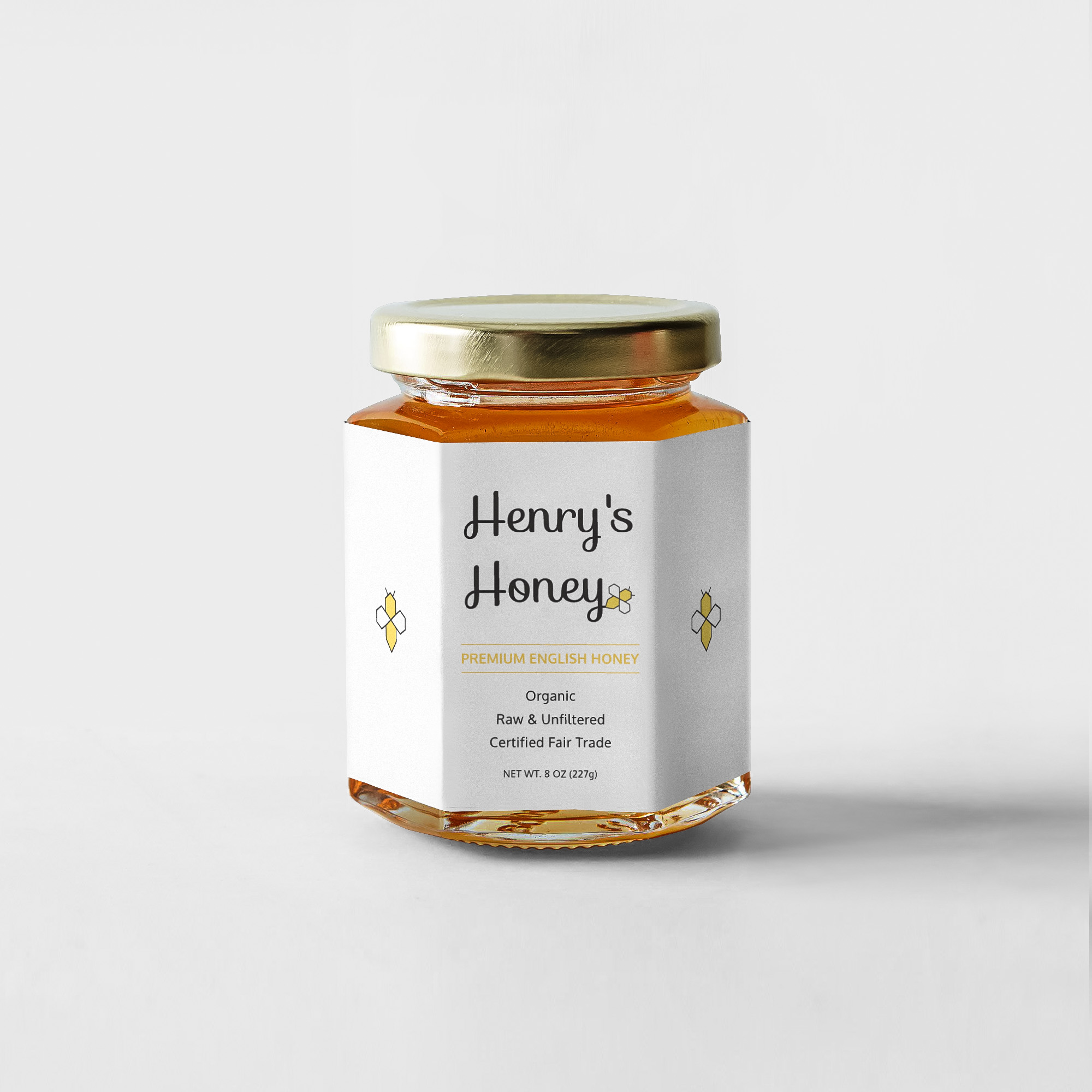
They want a clean, modern label and logo design that reflects their high-end, pure honey.
With this design, I went for a clean, elegant look. I wanted the “Henry’s Honey” typography to feel free-flowing as if to represent the flight and movement of the bee. The bee’s wings resemble a diamond shape, a symbol of luxury.
I began with a selection of keywords to describe the brand. From there, I gathered a selection of images to capture the mood and feeling those adjectives evoke. This is meant to give the client an idea of the visual direction the project will take.
Based on colors from the mood board, I created a color palette for the brand. Warm yellows to represent honey, and black to convey luxury.